The Umler interface provides the same navigational tools found in most Windows applications and Internet sites. This section provides basic explanations of the elements and components that assist in moving through the various pages of the application to complete tasks. Mouse and keyboard equivalents are discussed for each element.
Each page in a Railinc web application has the same structure.
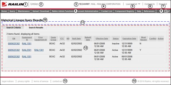
Exhibit 2. Railinc Web Application Page Layout
1 Logo—Railinc logo. Logo is link to the Railinc corporate website.
2 Application Title—Name of the application. This is also a link to the Home page of the application.
4 Company—Company user is representing. For individuals representing several roads. Selecting this link while logged on (hand pointer shown below) opens the Select Your Company page (Exhibit 28), to reselect the company on whose behalf the user will be working—without logging out.
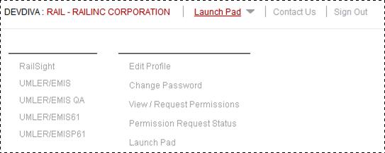
5 Launch Pad—Link where the user can click to go directly to the SSO Launch pad, or hover over to display a dual drop-down menu to switch to other authorized Railinc applications (left side) or go to the SSO User Services functions (right side), e.g., change passwords, request other applications, etc. (Exhibit 3).
Exhibit 3. Launch Pad Link Drop-Down Menu
6 Contact Us—Opens a page of contact information (local road, Railinc support).
7 Sign Out—Logs out of current application and returns to the Railinc SSO login page.
8 Application Menu—The top of the Railinc page displays the application menu options. The options on this menu allow you to perform the various functions of the application. Some specific options include:
· Help—Opens a new window with page-specific help.
· References—Opens a page with links to various reference documents (e.g., user guide, specification manual, etc.).
9 Display Unit Lookup—Selecting the icon ( ) allows the user to look up and display a unit in a new window without interrupting work on the current page. The Display Unit window can be closed when viewing is completed.
10 Page Title—The title of the specific application task page.
11 Message Area—Area under the page title which displays messages as needed (shown outlined with blue dashes). Error messages are red with a light red background. Informational/warning messages are black on a light yellow background. Success messages are green on a light green background.
12 Page content area—The area of the page where tasks are executed (shown outlined with red dashes). These vary and may include a number of different elements, which are described in the next sections.
13 Legal Links—This area at the bottom left of each page contains links to applicable legal notices, privacy rights, terms of service, and the Contact Us.
14 Copyright—This area at the bottom right of each page shows copyright information.
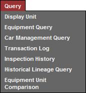
Application Menu
Exhibit 4. Application Menu
Each application menu item can be a specific single task or open a drop-down menu. When no menu exists, the task begins immediately after selecting. Otherwise, a drop-down menu is displayed (Exhibit 5). Tabbing allows the user to visit each menu, right-to-left, and top to bottom sequentially. For this reason, the mouse is the method of choice for menu navigation and selection of tasks.
Note: Menu items are role-specific. See the local application SSO Administrator to request additional menu items.
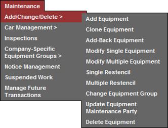
Drop-Down Menu
Note: Tasks shown on drop-down menus and submenus can vary by user, based upon the user’s permissions set in SSO. See the local application SSO Administrator to request additional menu items.
Exhibit 5. Drop-Down Menu
Drop-down menus represent tasks that can be selected by left clicking with the mouse (or pressing Enter when the item is highlighted). If the task has a right arrow (>), a submenu (Exhibit 6) appears when selected.
Note: Menu items that appear in light gray are in development for future releases.
Submenus
See the Note about available menu items.
Exhibit 6. Submenu
Submenus appear whenever the mouse moves over the indicated menu option (or while tabbing through the menu items). Submenus represent tasks that can be selected by left-clicking with the mouse (or pressing Enter when the item is highlighted, as shown in Exhibit 7).
Exhibit 7. Highlighted (focused) Menu Item
Hyperlinks appear in the application as underlined text. Selecting a hyperlink displays a page related to that subject (frequently additional details) or a tool to perform the indicated task.
Exhibit 8. Unselected Hyperlink
Exhibit 9. Highlighted (focused) Hyperlink
To select a hyperlink, left-click with the mouse, or press Enter when the link is focused.
Text Boxes
Text boxes are simply empty fields that allow you to enter text. For example, the fields that allow you to enter your User ID and password are text boxes (Exhibit 10). When entering a password the characters are encrypted and appears as a series of asterisks (*).
Exhibit 10. Text Boxes
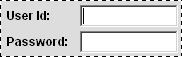
Text boxes may have limits for the type of data to be entered (i.e., alpha, numeric, special characters), and/or the amounts of input (e.g., 255 characters), and the formatting allowed (e.g., date and time, use of hyphens/slashes).
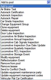
Drop-Down Text Boxes
Some text boxes have arrows located on the right side. These arrows indicate that predetermined input options are available for that text box. Selecting the arrow displays a list of the available data entry options. Select one of the available choices by clicking it, or pressing Enter when the item is highlighted.
Exhibit 11. Drop-Down Text Box
Longer Drop down lists can have a scroll bar at the right, and most longer lists also offer first letter navigation, where typing a letter or number scrolls to that part of the list (Exhibit 12). Scrolling using the scroll bar and button is described in Scroll Bars/Buttons.
Exhibit 12. Drop-Down Text Box with Scroll Bar
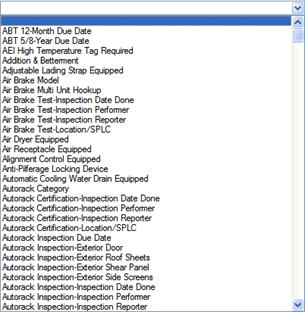
Note: Selecting the blank entry at the top of the list indicates “no” choice.
Some text boxes allow multiple selections (Exhibit 13). Use the Shift key to select a range of options or the Ctrl key to select multiple, nonsequential items in a list. To select all items in the text box, press Ctrl+A (select all).
Exhibit 13. Multiple Selection Text Box
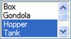
Scrolling in a multiple selection text box does not select or deselect items. To deselect a single highlighted item, press Ctrl and select the item.
Check Boxes
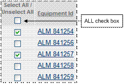
Check boxes appear under the Select heading on the far-left side of many results lists/tables. Select the empty check box beside the item wanted (click with mouse or press the spacebar when the check box is focused). A selected check box contains a check mark. Select as many check boxes as applicable. To uncheck, select again. In Exhibit 14, two records are selected for further action.
Note: Use the Select All/ Unselect All check box to select ALL items in the list. To unselect everything in the list, uncheck the ALL check box.
Exhibit 14. Checked Check Boxes
To perform an action on records, first check them and then select the desired command button, such as View and Validate.
Radio Buttons
Radio buttons are similar to check boxes, except only one selection can be made. When a radio button is selected, a dot appears in the marked circle. Selecting one radio button unselects any other that may have been selected previously.
Exhibit 15. Radio Button (AM/PM indicator—AM selected)
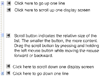
Many Railinc applications have scroll bars and buttons. Some pages may have multiple scroll bars (page scroll bars and list scroll bars). These can be very close, so make sure to navigate using the correct scroll bar.
Exhibit 16. Scroll Bar/Button and Usage
Command Buttons
Command buttons are used to execute tasks on web pages. Command buttons are generally at both the top and bottom of web pages. To activate a command button, select the button with a left mouse click, or press Enter or spacebar when the button has focus (see Exhibit 17).
Exhibit 17. Command Button (with focus)
Exhibit 18 contains general descriptions of buttons found throughout the Railinc and the Umler interfaces.
Exhibit 18. Command Buttons
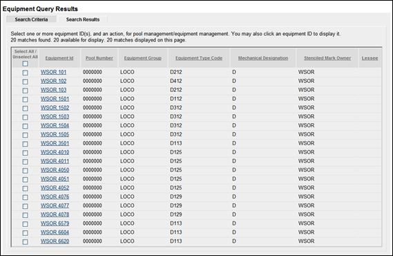
Workflow Tabs
Multiple-step workflows can sometimes be captured in tabbed panel design to provide a logical, step-wise sequence of user activity that corresponds to a business process.
Exhibit 19. Web Page with Tabs
Tabs allow the user to “toggle” between related pages (like Search Criteria and Search Results for consecutive searches on most query pages). The lighter tab is currently active.
Back and Forward Buttons
The back and forward buttons (Exhibit 20) in the Internet browser’s toolbar can be used to move between pages when no navigation is provided. Caution should be observed when trying to navigate back to a screen viewed several screens previously. Once a transaction has been submitted to the system, it is not possible to reverse or undo the transaction through the use of the back button.
Exhibit 20. Back and Forward Buttons
Note: It is recommended that the Back button NOT be used, since it would not dynamically update a cached page.
Icons
Icons are graphic images used to display conditions, status, or to invoke secondary searches.
Exhibit 21. Icons
|
Icon |
Description |
|
Notifications |
|
|
|
Can be used to emphasize an approval. |
|
|
Can be used to emphasize a warning. |
|
|
Can be used to emphasize an error. |
|
|
Can be used to emphasize a case where an unknown state exists. |
|
|
Can be used to indicate a neutral message. Can also be used to trigger a fetch of additional information. |
|
Searches/Lookups |
|
|
|
Use to start a secondary search. For Example, SPLC, Elements. |
|
|
Use to start date selection calendar popup. |
|
|
Use to open a Display Unit Lookup in a new window. |
|
Line Item Manipulation |
|
|
|
Can be used to add a line item when an Add button is not provided |
|
|
Delete a line item. |
|
|
Edit a line item. |
|
|
Confirm a line item. |
|
|
Save a line item. |
Calendar
Most Railinc calendars operate in the same way to select a date needed in the field. The default date is usually today. Using the calendar automates correct date formatting (slashes vs. hyphens, etc.).
Exhibit 22. Calendar
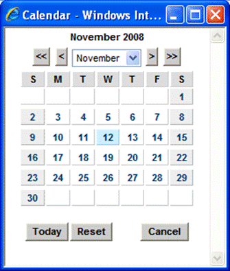
Use the < and > buttons to move backward or forward by month (or use the month drop-down). Use the << and >> buttons to move backward or forward by year.
When on the correct month, select the appropriate date (double-click with mouse—or tab to day and press Enter). The calendar panel closes and the picked date shows in the “Date” field.
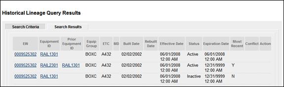
Tables
Many web pages use tables to display complex lists after searches, or to organize data.
Exhibit 23. Table
Tables longer than one screen have a scroll bar at the right.
· Links at the top of table columns may provide sorting capability, ascending or descending.
· Links (hyperlinks) within the table structure generally open other pages with more detailed information for the record item when selected (see Hyperlinks).
Umler-Specific Interface Elements
This section describes the Umler-specific interface elements.
Umler Application Menu
Exhibit 24 show the Umler application menu.
Exhibit 24. Umler Application Menu(split for readability)
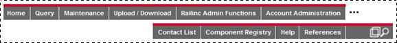
The Umler application menu provides the following functions:
Exhibit 25. Umler Application Menu Functions
|
Menu Item |
Function |
|
Goes to the Umler Welcome page. |
|
|
Opens the Query menu. |
|
|
Opens the Maintenance menu. |
|
|
Opens the Upload/Download menu. |
|
|
Opens the Railinc Admin Functions menu. For Railinc Administrators only. |
|
|
Opens the Account Administration menu. |
|
|
Opens the FindUs.Rail application. |
|
|
Opens the Component Registry menu. Described in the CEPM User Guide (see References). |
|
|
Opens online help for the displayed page. |
|
|
Opens the Umler References page in Railinc.com. |
|
|
|
Opens a Display Unit Lookup in a new window. |
Umler Checkbox Toggles
On certain pages, Umler uses a checkbox to modify the appearance or display of data. These include:
Use Spanish for Error Messages and Properties—check to toggle to Spanish language
Show database values—check to show unformatted database values
Differing elements only—check to differences values (used in Compare Equipment)
Flat View—check to display truck components grouped by element in location order
Unchecking the check box returns the data to its default appearance.
Umler Command Buttons
Umler uses some application-specific command buttons.
Exhibit 26. Umler-Specific Command Buttons
|
Name |
Function |
|
Accept |
Accepts a pending access right granted by another company (Exhibit 317). |
|
Add Equipment Right |
Opens the Equipment Access Right page (Exhibit 294). |
|
Add Inspection Right |
Opens the Inspection Access Right page (Exhibit 297). |
|
Add Pool Right |
Opens the Pool Access Right page (Exhibit 292). |
|
Add View Confidential Data Right |
Opens the View Confidential Data Access Right page (Exhibit 314). |
|
Assign to Profile |
Opens the Manage Security Profiles (Exhibit 302) |
|
Assign to User |
Opens the Intra-Company User List (Exhibit 319) |
|
Clone |
Clones an existing security management profile (Exhibit 302). |
|
Clone Rights |
Selects the user whose rights are being cloned. (Exhibit 300) |
|
Clone Rights from Another User |
Opens the Select Access Right Source page (Exhibit 300). |
|
Collapse All |
Causes table structure to collapse to headings only. Used with + and - icons |
|
Confirm Clone Rights |
Applies cloned rights to the recipient (user). (Exhibit 301) |
|
Continue |
Authorizes charges for downloadable queries (Exhibit 50). |
|
Count Equipment |
Provides an equipment count for rights being assigned to a user. |
|
Decline |
Declines a pending access right granted by another company (Exhibit 317). |
|
Element Selection |
Toggles back to the Select Elements for Update page for Modify Multiple Equipment Units (Exhibit 114). |
|
Estimate query cost |
Use to estimate cost of a billable CSV download query (Exhibit 50). |
|
Expand All |
Causes table structure to expand to headings and subheadings only. |
|
Go |
While in view by location after incrementing the component count, adds an additional component location. (Exhibit 110) |
|
Grant Access Rights |
Opens the Update Access Rights page for the selected company |
|
Grant Profiles |
Opens the Manage Security Profiles page for the selected company |
|
Relinquish |
Surrenders a previously-accepted right from another company (Exhibit 318) |
|
Restore |
Restores (activates) a deleted notice (Exhibit 190 and Exhibit 191) |
|
Revoke |
Revokes access right granted to another company (Exhibit 312) or a security profile granted to another company (Exhibit 315). |
|
Send to Depre |
Sends a list of changed equipment notification to the Deprescription group. See Exhibit 237. |
|
Show Equipment |
Shows list of equipment assigned to a specific pool (when viewing a pool header). See Exhibit 69. |
|
Switch View |
Toggles Equipment details page (e.g., modify, etc) to show components by physical location on car. (Exhibit 109 and Exhibit 110) |
|
Transfer |
Requests (and confirms) the transfer of specified access rights from one company to another (Exhibit 338). Railinc Administrators only. |
Umler Icons and Indicators
Umler uses application-specific icons and indicators to assist the user:
Exhibit 27. Umler-Specific Icons
|
Icon |
Description |
|
|
Umler-Specific Icons |
|
|
ETC Generation field |
|
|
Mandatory Element field |
|
|
Rating field |
|
|
Element in conflict indicator. Record needs attention to remove the conflict |
|
|
Copy entry in field to all fields below (notably for Inspections), or change query results display order (move selected item down) |
|
|
Move entry into field at right (Query Output Attribute options) |
|
|
Move entry into field at left (Query Output Attribute options) |
|
|
Change query results display order (move selected item up) |
|
|
Assigns selected security profile to user ID |
|
|
Assigns all available security profiles to user ID |
|
|
Unassigns selected security profile from user ID |
|
|
Unassigns all security profiles from user ID |
|
+ |
Expands directory (table) structure |
|
- |
Collapses directory (table) structure |
|
|
Calculates due date for related date fields (Inspections). |
|
|
Copy entry in field to all fields below (in Modify Multiple Equipment) |
Legal Notices | Terms of Service | Umler Reference Materials
© 2013 Railinc Corp. All rights reserved.